MakeMyTrip
2024
Making Booking Outcomes Clear: Reducing Support Queries by 25.8%
I redesigned Goibibo’s ground transport Thank You flow into a clear, state-aware experience that helped users understand successful, pending, and failed bookings, take the right next action, and discover relevant post-booking services without adding visual clutter.

Overview
Background
The Thank You page is the first screen users see after completing payment. Although it appears at the end of the booking flow, it is not simply a confirmation screen. It must communicate whether the booking was successful, pending or failed; show important journey and traveller information; explain what happens next; and provide recovery options when something goes wrong.
During discussion with Product Manager for trains funnel, we came on the conclusion that the page needed to distinguish payment failures from IRCTC failures, prioritize the PNR over the internal booking ID and support shared modules such as Manage Booking, cashback and cross-sell. Business goals, formal research and success metrics were still open in the initial brief.
For the redesign I focused on the Trains funnel and then the design was used across the entire product
My role and ownership
I owned the experience from the initial audit through state definition, information architecture, user flows, interaction design and implementation review.
I began by reviewing the existing post-booking flow and identified eight usability gaps related to hierarchy, status visibility, action clarity and content density. I then mapped the system outcomes and organized them into five top-level states.
Through this process, I found that the page did not simply need a cleaner interface. It needed clear rules for what information should appear, in what order and under which booking condition. I used these findings to build a reusable system rather than designing separate screens without shared logic.
Impact
Following launch, booking-status and confirmation-related support queries decreased by 25.8% compared with the pre-launch baseline.

Problem
The main problem was not the number of booking states. It was the way information was organized.
On the existing page, booking confirmation, journey details, actions, policies, customer support and promotional content had similar visual importance. Users had to scan through multiple cards to answer three basic questions:
Did my booking go through?
What exactly was booked?
What should I do next?
This became especially difficult when a booking was pending, waitlisted or unsuccessful.


The business goal
The business wanted to keep customers within the Goibibo ecosystem by introducing My Trips, return journeys and other relevant services after booking.
However, showing these modules too early or too prominently risked competing with the confirmation task. The challenge was to create space for business opportunities without reducing trust or making essential booking information harder to find.
Solution : A State-aware system that focuses on all the booking states.
I redesigned the page as a modular, state-aware system rather than one fixed layout.
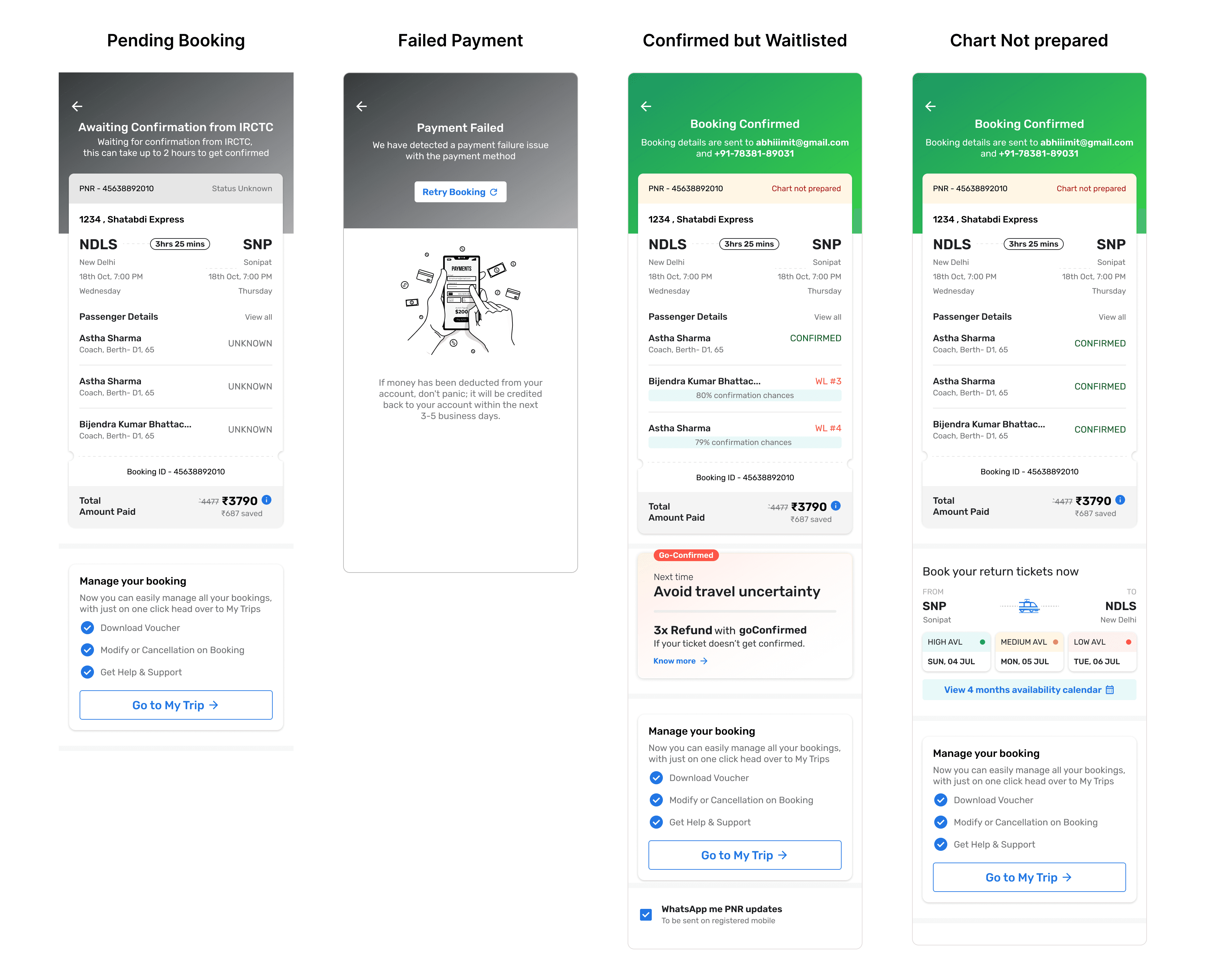
The system first identifies the booking outcome and then changes the message, information order and actions shown to the user. Successful users see their confirmation and ticket details before related services. Pending users receive clear expectations and notification options. Failed users see the reason, payment or refund information and the safest recovery action.
Research
How I approached research
Because this was an existing transactional product, I focused on evaluative research rather than broad exploratory research.
I used an experience audit to understand where the interface was visually and structurally difficult to scan. I reviewed booking-related support queries because they showed which questions users could not answer on their own. I also mapped payment, IRCTC and booking responses with the product flow to understand what the system knew at each stage and which actions were safe to offer.
This research helped me identify three important findings:
Users needed booking status before any secondary information.
Pending and failed bookings required different messages and actions.
Cross-sell was most useful after the user’s immediate booking concern had been resolved.
Research Insights
|
Opportunity space
The opportunity was not to remove useful information. It was to reveal information in the right order and at the right moment.
My guiding question became:

Through my research and analysis, I identified opportunities to make the experience responsive to each booking state, support self-service recovery and introduce ecosystem offerings at the right moment. These opportunities shaped a modular confirmation system that prioritized booking clarity first, recovery second and relevant cross-sell only after the user’s immediate concern was resolved.
Opportunity 1 - Make the page a self-service and recovery surface
Pending, failed, waitlisted users needed more than a status message. They needed to understand what had happened, whether their payment was safe and what they could do next.
I used this opportunity to introduce clear explanations, payment and refund information, notification options and state-specific recovery actions. This helped users resolve more booking questions without depending on customer support.
Introduce cross-sell after resolving the primary hierarchy
The business wanted to keep customers within the Goibibo ecosystem so I introduced cross selling through return journeys, My Trips and other post-booking services. However, showing these options too prominently could compete with booking confirmation and reduce trust.
I treated this as an opportunity to make cross-sell contextual:
Prominent after a stable, successful booking
Deprioritized while a booking was pending
Removed during unresolved payment or failure states
This allowed the experience to support business growth without distracting users from critical booking information.

Designs
Design Decisions based on Use cases
All travellers confirmed
I made the successful outcome immediately visible and prioritized the PNR, booked route, travel date and traveller details. Download Ticket and My Trips became the primary actions. Return trips and other related services appeared after the confirmation task.


Waitlisted or mixed traveller status
A successful payment does not always mean every traveller has a confirmed seat. I displayed status at the traveller level so that one overall label would not misrepresent a mixed booking.
The screen explained the waitlist status and provided access to PNR updates, notifications and My Trips.

Payment and IRCTC failures
I separated payment failure from booking failure because they require different recovery actions.
A payment failure could allow a safe payment retry. An IRCTC failure needed to explain the booking reason and allow the user to modify their selection or return to the review page without starting over.
I also designed for generic failures, preference-related failures, recovered sessions, expired access, route variations, children under five, split seats, long names and mixed traveller statuses. The full use-case and edge-case matrix is included in the project presentation.Challenges I came across during iteration

Decisions made during challenges
Challenge | How I handled it | Outcome |
|---|---|---|
Confirmation and cross-sell competed for attention | I created state-based eligibility and placed business modules after the core task | Cross-sell remained available without weakening status clarity |
IRCTC and payment responses were asynchronous | I separated short pending, long pending, failure and recovery states | Users received more accurate messages and safer actions |
One framework had to support train, bus and cab | I created a shared shell with product-specific modules | The system remained reusable without hiding train-specific needs |
Traveller and route data varied significantly | I stress-tested layouts with long names, mixed statuses, route segments and large groups | Components remained readable across realistic data conditions |
Retry could create duplicate bookings | I tied Retry visibility to a safe backend response | Recovery actions did not increase duplicate-booking risk |
Shared components had different owners | I defined content order, eligibility and fallback behavior before final UI | Dependencies were clearer during implementation |
The initial PRD lacked defined business metrics | I connected each design goal to a measurable behavior | The team could evaluate clarity, recovery and ecosystem engagement after launch |
Impact Metric
Primary KPI: Booking-status support queries and Secondary Metric: Cross-sell engagement
25.8% reduction booking-status support queries
I selected booking-status support queries as the primary KPI because the main user problem was unclear confirmation information. When users could not understand whether their booking was successful, pending or failed, they often contacted customer support for clarification.
I measured queries related to:
Booking confirmation and status
Missing ticket or PNR
Pending bookings
Payment deducted but booking not confirmed
Failed bookings and refund status
Waitlisted or partially confirmed travellers
The reduction was supported by several design changes:
Making booking status the first and most prominent information
Prioritizing the PNR for train bookings
Separating success, pending and failure experiences
Showing traveller-level status for waitlisted and mixed bookings
10–15% increase in cross selling engagement
I tracked engagement only for eligible users whose bookings had reached a stable successful state. Pending and failed users were excluded because resolving their current booking was more important than promoting another service.
Following launch, engagement with relevant post-booking cross-sell modules increased by 10–15%.
This improvement was supported by:
Moving cross-sell content below confirmation and journey details
Showing it only after the primary booking task was resolved
Making recommendations relevant to the user’s journey
Reflection
What I learned
This project taught me that simplifying an experience does not always mean removing information. In this case, the larger opportunity was to decide what users needed first, what could wait and what should only appear in certain states.
Mapping the system before designing the screens helped me create a solution that supported both user clarity and business needs. It also changed how I think about confirmation pages: they are not simply the end of a transaction, but an important space for reassurance, recovery and continued engagement.
What I would do differently
If I repeated the project, I would define the analytics and support taxonomy at the beginning of the work so that every state had a clear baseline. I would also conduct short comprehension tests using realistic booking data, including mixed traveller statuses and payment uncertainty. This would allow me to validate not only whether users liked the page, but whether they could correctly explain what happened and choose the right next action.

