Back
Shipped
Post - Booking Experience
Data-driven decision
Information optimization
Redesigned the ground transport booking confirmation experience reducing cognitive Load by 35% with focus on improve scanability, trust, and informstion clarity
I worked as a Product Designer on redesigning the ground transport booking confirmation (Thank You) experience, where I owned the end-to-end journey. I started by auditing the existing post-booking flow and identified 8 key usability gaps, which showed me exactly where users were getting confused. From there, I created a state-driven system with 5 key use cases and restructured the information architecture to better match what users actually need in that moment. I explored different layout directions and kept refining the hierarchy to make the page easier to scan and understand. While working through complex booking scenarios, I realized the problem wasn’t the complexity itself, but how the information was being presented. To fix this, I designed a modular system that adapts to different booking states. After launch, this led to a 25.8% reduction in booking-related support queries, particularly those related to booking confirmation and status clarity. We also saw a 10–15% increase in cross-sell engagement, along with improved user confidence in completing post-booking actions.
Team
1 Product Designer (Me) Solo designer, 1 Design Lead, 2 Developer
My Role
Product Design Intern at MakeMyTrip
Timeline
Heuristic Evaluation, Competitive Analysis, Mental Model Mapping, Information Architecture, Interaction Design
Duration
3 weeks

Background
The Thank You page is a critical moment in the booking journey where users expect confirmation, clarity, and next steps. However, the existing experience tries to accommodate multiple outcomes (success, pending, failure) without a structured system, leading to confusion and poor usability.
Problem
This made it hard for users to answer a simple but critical question:
“Is my booking confirmed, and what should I do next?”
I also identified 4 key use cases that were most critical, which helped me design UI patterns capable of handling edge cases while maintaining clarity.
Partial journeys (A→C, B→D, B→C)
Child passengers (<5 years, no seat allocation)
Seat breakup (passengers not seated together)
Name truncation and formatting
Goal

SOLUTION
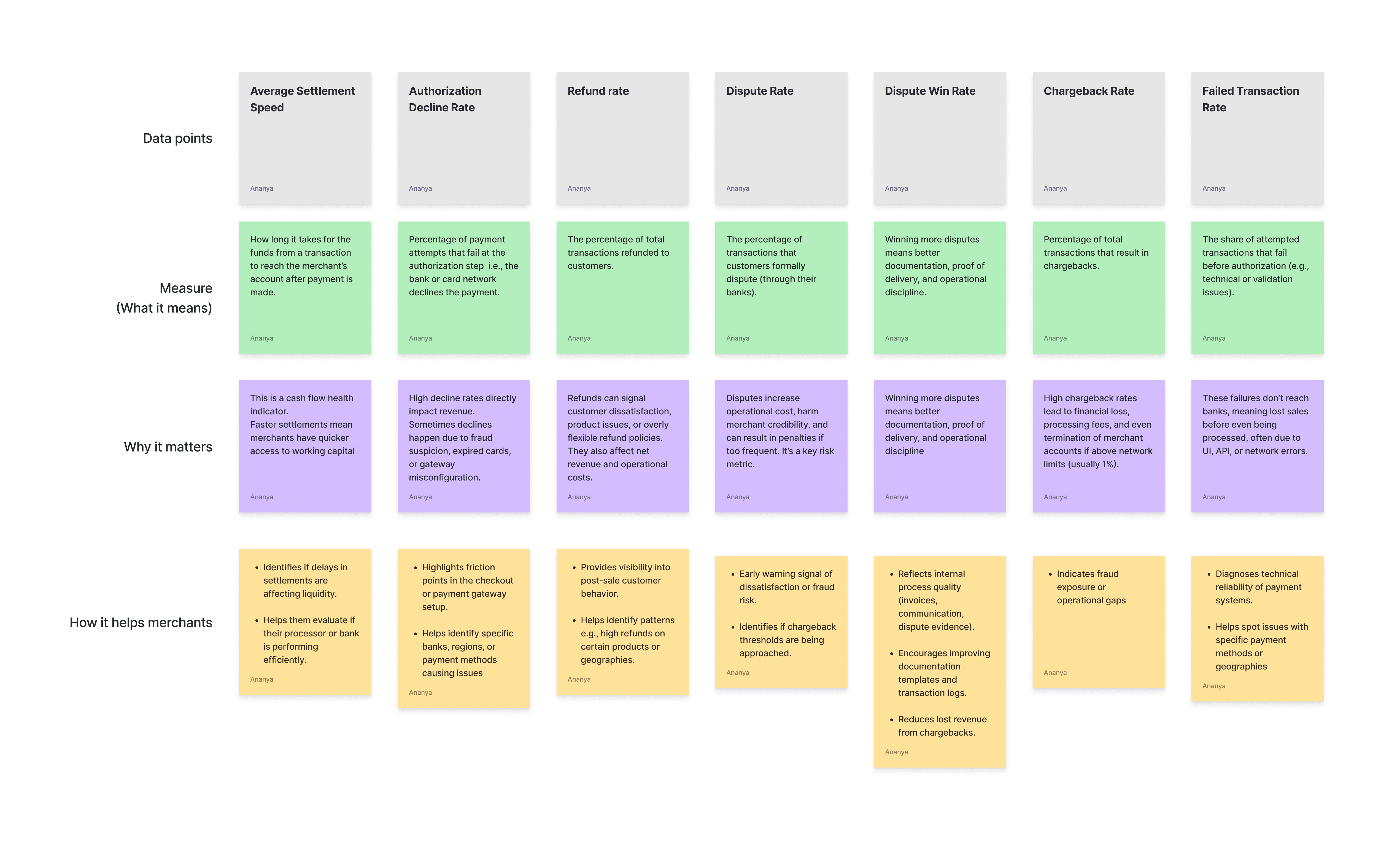
The Merchant Statement redesign aimed to transform a complex spreadsheet of data into helping merchants quickly understand how their business is performing
The design journey evolved through several iterations, each focused on a different layer of refinement — from defining the right data points, to establishing hierarchy and visual clarity, to testing with users and aligning business goals with usability.
Iteration 1: Defining the Foundation
" Focus: Getting the right data points and building information hierarchy "
At this stage, my priority was not visuals, but information clarity. The goal was to identify what truly matters to a merchant looking at their financial statement which metrics help them make decisions, and which can be de-emphasized.
I started by conducting secondary research across payment and financial products such as Stripe, PayPal, and Airwallex to understand how similar platforms present payment and settlement data. From this, I identified a set of core data points like total transaction volume, processing success rate, and net margin that could reflect business performance at a glance.
Challenges
The main struggle here was deciding what information actually mattered to merchants. There was a lot of available data, but not all of it was useful. I had to balance between showing too little and overwhelming the user with too much information. I felt at this stage, it wasn’t about visuals it was more about clarity in decisions making took.
What I learned:
Even if something looks “data-rich,” it’s not valuable unless it drives an action.

Iteration 2: Structuring and Expanding the Data
" Focus: Improving hierarchy, breaking down data complexity, and adding key business metrics."
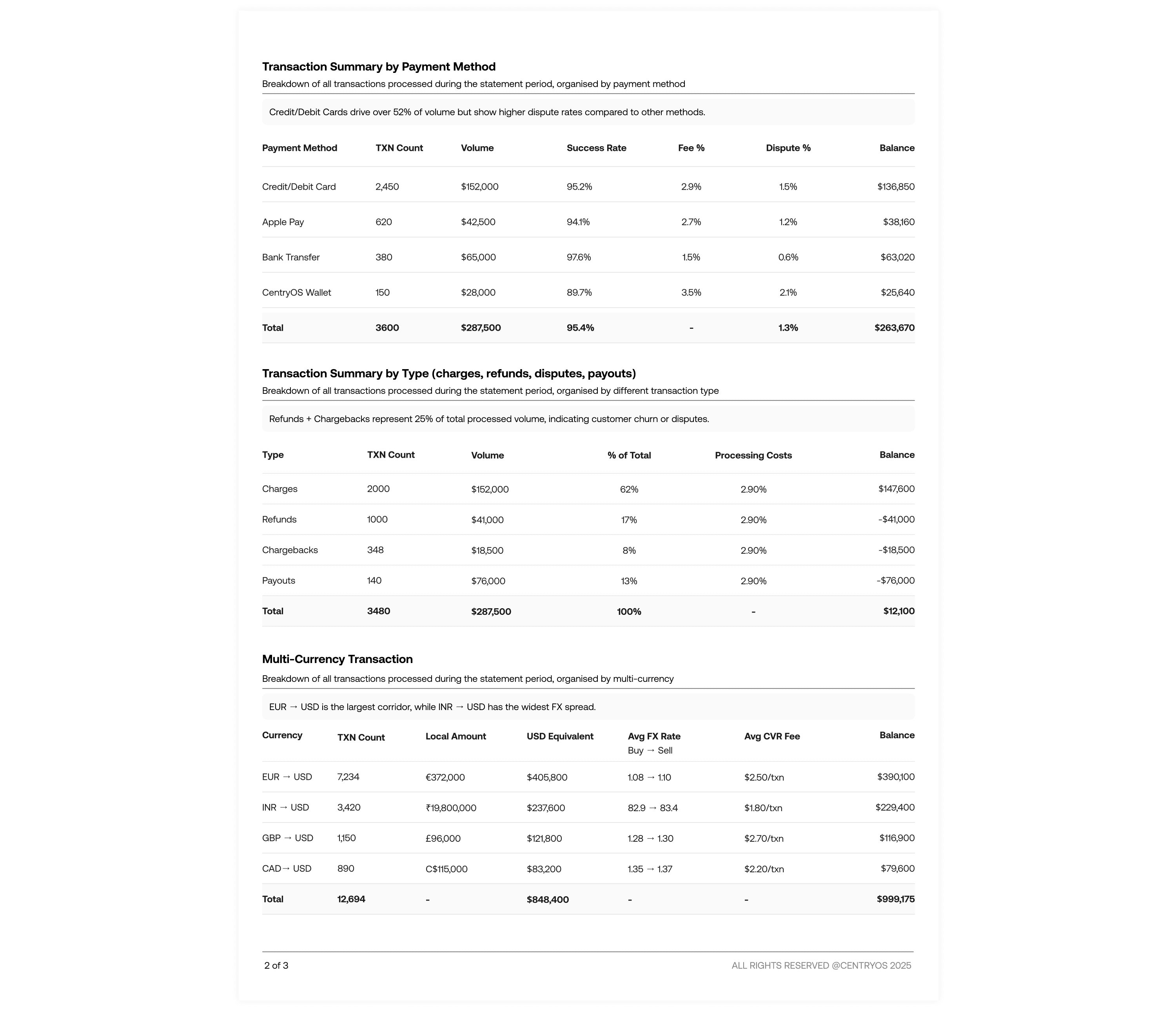
In the second iteration, I experimented with layout structure and data organization, creating multiple versions to test which hierarchy communicated the information most clearly. I eventually found a balance between readability and density — showing more data, but in a way that didn’t overwhelm the user.
At this stage, new metrics were introduced following business feedback. After discussions with the CEO and design advisor, it became clear that the company wanted to surface payment health and risk metrics to help merchants assess operational efficiency and they wanted to see how merchants respond to such data.
Challenges
Once the data points were defined, the challenge became arranging them logically and visually. I experimented with different ways to break down and layer information for better hierarchy.
What I learned:
Finding the right balance between business goals and user understanding.


Iteration 3: Focusing on Visual Hierarchy and Scannability
" Focus: Making the statement more intuitive and visually engaging "
Building on the earlier information framework, this iteration was about how the data feels. I wanted the merchant to get a quick, intuitive understanding of their monthly settlement almost like getting a health snapshot of their business.
The design introduced visual grouping and spacing logic that helped users quickly identify patterns like month-over-month performance and inflows vs. outflows. This meant organizing sections so that the eye could move naturally from high-level insights → detailed breakdowns, ensuring clarity and reducing cognitive load.
To support quick comparisons, I added review previous month’s data side-by-side, enabling merchants to spot trends immediately.
Challenges
Here, I wanted to make the information feel alive and useful at a glance. The idea was to help merchants instantly see how their balance or settlements compared to previous months. The challenge was getting the visual hierarchy right
What I learned:
Small visual cues (like spacing, color weight, and typography hierarchy) can completely change how quickly users understand information

Iteration 4: Testing, Simplifying, and Refining for Clarity
" Focus: User testing insights and balancing detail with simplicity."
User testing revealed an important behavior pattern:
Most merchants primarily reviewed page one for insights and totals — very few navigated to the detailed breakdowns unless they were troubleshooting or reconciling discrepancies.
I condensed key metrics and summaries onto the first page, ensuring that the essential business story could be understood at a glance.
The detailed tables (e.g., transaction logs, multi-currency breakdowns) were still accessible, but no longer required for a meaningful first read.
I also refined the spacing, alignment, and column relationships so that the layout felt balanced and readable, rather than like a traditional financial sheet.
Challenges
User feedback showed that while the data was clear, merchants wanted key visuals and summaries right upfront. Many users didn’t go beyond the first page unless necessary.
The challenge was to compress important insights onto the first page without losing detail or context and keeping everything visually balanced
What I learned:
Less data can be more when it’s well-prioritized really well. Designing for real-world reading patterns helped me create a more practical, user-centered design.
Final Design


Impact of the first design role out
40–60% reduction in time spent reading reports
30–40% increase in monthly statement views
25–35% reduction in merchant support query
What I learned from this project ?
Prioritizing information early helped define a strong foundation for later designs. Getting the data right made the decisions more grounded and purposeful in later visuals stage.
Collaboration with stakeholders revealed that the “right data” isn’t only what’s readable it’s what aligns with business goals and user value simultaneously.
Visual hierarchy is not just aesthetics, it’s the design language that shapes comprehension.
In data-heavy products, clarity isn’t about showing everything, it’s about showing the right things, in the right order.
Copyright ©2026. All right reserved Ananya Vashist


