Back
Shipped
Feature Design
Behavioural Design
Impact Driven
I Redesigned the flight refund flow for MakeMyTrip, boosting click-through by 27% and reducing support-related friction by 60%.
MakeMyTrip introduced “Refund to My Wallet” to reduce PSP (Third party payment) fees and keep users in the flights ecosystem but still the user adoption stayed low and company had to pay the cost.
Here I stepped in as a solo designer and redesigned the decision screen using discoverability, scannability, and persuasion design principles to increase wallet selection and reduce refund-timeline queries.
Company
MakeMyTrip ( Largest Travel Tech Platform )
Project Duration
2 weeks
My Role
Solo Product Designer in collaboration with 1 Product Manager, 1 Design Lead , 1 Developers
Skills
Behavioural Design, Cross-functional Team Collaboration, Business-oriented Design Thinking, Interaction Design

Impact achieved after the development
27.5% increase in selection if My wallet option by users
11.4% uplift in screen engagement (measured via click tracking)
60% drop in customer service calls about refund timelines
Overview
In Summer 2023, I interned as a User Experience Designer at MakeMyTrip (MMT), India’s largest online travel platform. With a user base of over 54.92 million users, MMT provides end-to-end travel services including flights, hotels, cabs, and local experiences.
Operating at this scale requires efficient systems, especially in the post-booking experience where customer trust is tested so small frictions in post-booking flows (cancellation/refunds) can quickly turn into trust issues, support volume, and business cost.
What is the Problem Space ?
MakeMyTrip introduced “Refund to My Wallet” on the refund selection screen to
Reduce PSP (third-party payment provider) fees
Keep users inside the MMT flight ecosystem so they could rebook faster and increase repeat usage.
However, after launch, adoption stayed low. Users continued selecting Refund to Original Payment Method. That had a compounding impact on other places as well:
Operations Team
Refund-related query calls increased
Third -party Cost increased
PSP fees rose because fewer refunds stayed inside the wallet system
User Experience
Users became impatient waiting for refunds resulted in satisfaction dropped
Business suffers
Brand trust declined ,rebooking/retention opportunities were lost.
Here is what I figured
Users were not choosing wallet because the refund selection experience didn’t help them understand, trust, or feel confident about the wallet option.
Why This Problem Matters ?
Refund processes are a key post-booking touchpoint where user trust is either reinforced or eroded. When users face confusion or delay during refunds, it not only affects their experience but also leads to avoidable business costs.
Business Impact
Retaining refunds in the MMT wallet ensures users remain within the MMT ecosystem, encouraging faster rebooking.
Operational Cost
Reducing third-party payment reversals saves on processing fees
User Satisfaction
A clearer, benefits-driven refund experience can lead to greater trust in the brand and fewer support calls.
Business and Design Goals
How might we redesign the refund experience so that users feel confident choosing the "My wallet" option which can lead to faster refunds for users & increased retention for the business ?
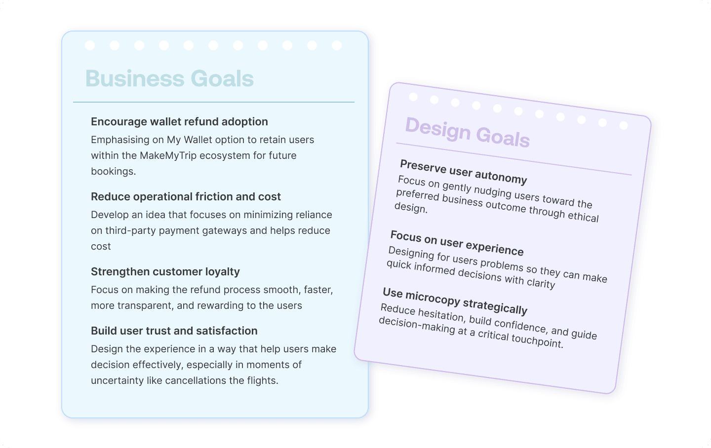
Solution : Driving user retention through behavioural UX
I redesigned the refund decision-making screen after the key insights from the quick research (Cognitive Walkthrough and Operational team interviews) I did on my end with current users that this was more than a UI issue, it was more of a behavioural decision making problem.
So I approached the solution by focusing on information clarity, visual distinction, and persuasive design
Discovery & research
This was a quick project with high urgency, so I prioritized research that directly informs design instead of long discovery. Two areas that I focused on were:
User Behavior around "My wallet" button
Here the idea was to identify why users ignored the my wallet refund option despite its benefits.
Identify the core of the problem space
This was to determine if the problem we are solving is a UI issue, a trust issue, or a more systemic design flaw.
My Approach was a lightweight study, I quickly validated the issue through
Understanding Behavior signals - so if the adoption is low then users are defaulting selecting to original payment mode option rather than "My Wallet Option"
Operations teams insights through interview highlighted the patterns in refund-related calls and user complaints about refund getting delayed.
UX audit of the existing screen highlighted content hierarchy, accessibility/scanning, persuasion gaps.

Actionable Insights
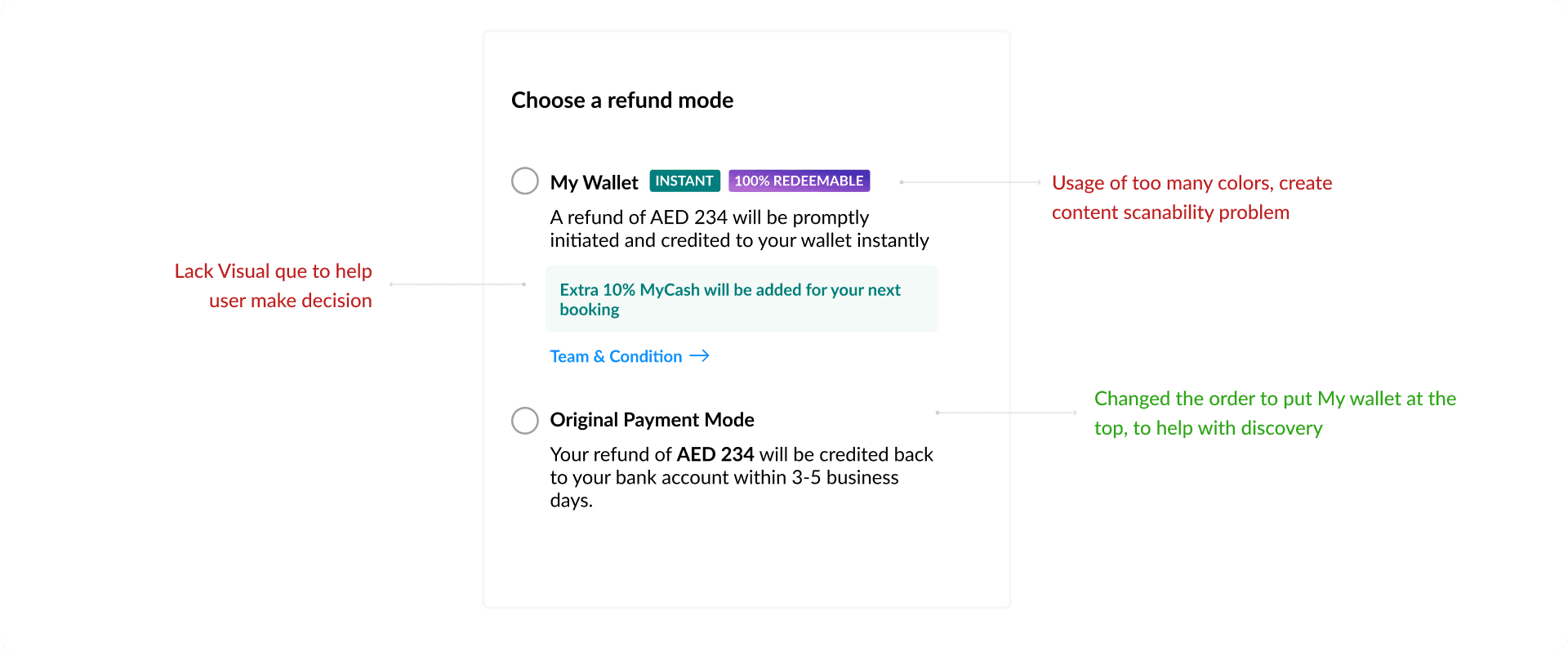
Content Overload
Users found the screen text-heavy and overwhelming. They skipped important details, including the wallet benefits, due to lack of visual hierarchy.
Default Bias
Users assumed the pre-selected refund-to-original-mode was the recommended or safer option.
The lack of contrast between options reinforced passive behavior.
User lack awarness and trust
Several users didn’t know what the MMT wallet was or felt uncertain about how soon they would get the money back. This unfamiliarity caused hesitation and a strong preference for their usual payment method.
Invisible Benefits
The advantages of using the MMT wallet were not noticeable., users overlooked paragraphs of dense text.

Project Constraints
While working on this project, there were several constraints that shaped the design approach I took and also synced with timelines
Time Constraint (2-week sprint cycle)
The project had to be designed, tested, and shipped within a narrow sprint window. This limited the depth of testing and iteration cycles, requiring fast but effective decisions based on available data.
GCC Regional Scope Only
The scope of this rollout was restricted to the GCC region due to localization priorities, meaning the solution couldn’t be tested globally despite its broader relevance.
Existing Component Library
MakeMyTrip’s mobile platform used a shared component system across booking, cancellation, and refund flows. Any major redesign needed to fit within this system to avoid engineering complexity.
Business Rules
Some backend refund policies (e.g., eligibility for wallet based on payment mode) were hardcoded and could not be changed during the scope of this redesign, limiting flexibility in default behavior or automation.
Design Ideas Explorations and Iterations
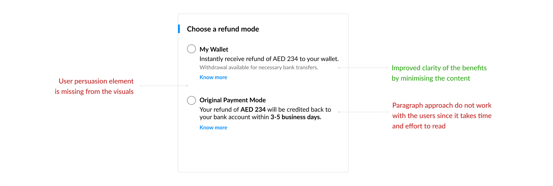
Final Design focused on Discoverability, User Persuasion and Clarity of content

Challenges during the project
Balancing User Freedom vs. Business Nudging
One of the key tensions in this project was encouraging users to select the wallet refund option without making it feel forced. While the business needed higher wallet adoption, my role as a designer was to respect user autonomy.
Iterating in a Fast-Moving, PM-Led Environment
At MakeMyTrip, PMs often drive roadmaps with aggressive targets. As the only designer on this feature, I had to present strong rationale for design decisions quickly, often backed by behavioral research or user testing insights.
What I learned from this project ?
Copyright ©2026. All right reserved Ananya Vashist


