
Shipped and Live
Fintech
Data-driven decision
Information optimization
Traditional merchant statements are dense, inconsistent, and often require merchants to do their own analysis. This creates frustration and slows down decision-making. Without clear visibility into trends, costs, and performance, merchants risk missing out on growth opportunities or failing to spot inefficiencies. A poor statement experience also reflects badly on the payment provider, reducing trust and engagement.
My role in the project was to redesign merchant statements that felt like a useful business tool. We wanted to make the data easier to read, highlight the numbers that actually matter for merchants, and turn complex payment information into clear, actionable insights.
Impact achieved after the development
40–60% reduction in time spent reading reports
30–40% increase in monthly statement views
25–35% reduction in merchant support query
Team
1 Advisior, 1 Developer, 1 Product Designer (Me) Solo designer
Project Type
Data Informed UX Designing
Timeline
Iterative sprints through Iteration 5
Niche
Cross‑border, blockchain‑based payments
About the Company
GradientFi is an embedded finance company (web2 front-ends/web3 back-end rails) that integrates cross blockchain infrastructure to power banks, fintechs, and marketplaces. API-first crypto banking infrastructure provides cross border liquidity on a shared ledger with FOREX matching engine, real world asset tokenization, and no-code smart contracts.
🎯
Objective
Make complex, multi‑currency payment data readable, trustworthy, and actionable so merchants can reconcile quickly and make decisions without parsing raw tables.
How can we turn dense merchant statements into clear, actionable insights?
This project is about rethinking how financial statements are presented to merchants. Instead of just rows of transactions, the final design focused on presenting aggregated views, actionable summaries, and cleaner layouts. By improving readability, hierarchy, and consistency across all tables, the statements became easier to navigate and more meaningful for merchants.
Design principles
I started with setting design principles in place so that I know what matters while it will also help me in making quick decision trade-offs. Having these principles in place will also make my choices more defensible each decision traces back to a principle, not my personal taste.
Hierarchy of data before aesthetics
Order and grouping of data gives more clarity then color ever will.
Being Clear with currency movement
Being transparent with how currency data flows and affects the business
Every number on the sheet has a meaning
If it doesn’t change behavior or explain totals, it’s noise.
Why This Problem Is Worth Solving
For building Merchant Trust
Statements are used for reconciliation, performance checks, and issue detection. If the math feels unclear, merchants will not trust the platform and they’ll open support tickets.
CHALLENGES DISCOVERY
Understanding the users challenges with the existing statement design

SOLUTION
The Merchant Statement redesign aimed to transform a complex spreadsheet of data into helping merchants quickly understand how their business is performing
The design journey evolved through several iterations, each focused on a different layer of refinement — from defining the right data points, to establishing hierarchy and visual clarity, to testing with users and aligning business goals with usability.
Iteration 1: Defining the Foundation
" Focus: Getting the right data points and building information hierarchy "
At this stage, my priority was not visuals, but information clarity. The goal was to identify what truly matters to a merchant looking at their financial statement which metrics help them make decisions, and which can be de-emphasized.
I started by conducting secondary research across payment and financial products such as Stripe, PayPal, and Airwallex to understand how similar platforms present payment and settlement data. From this, I identified a set of core data points like total transaction volume, processing success rate, and net margin that could reflect business performance at a glance.
Challenges
The main struggle here was deciding what information actually mattered to merchants. There was a lot of available data, but not all of it was useful. I had to balance between showing too little and overwhelming the user with too much information. I felt at this stage, it wasn’t about visuals it was more about clarity in decisions making took.
What I learned:
Even if something looks “data-rich,” it’s not valuable unless it drives an action.

Iteration 2: Structuring and Expanding the Data
" Focus: Improving hierarchy, breaking down data complexity, and adding key business metrics."
In the second iteration, I experimented with layout structure and data organization, creating multiple versions to test which hierarchy communicated the information most clearly. I eventually found a balance between readability and density — showing more data, but in a way that didn’t overwhelm the user.
At this stage, new metrics were introduced following business feedback. After discussions with the CEO and design advisor, it became clear that the company wanted to surface payment health and risk metrics to help merchants assess operational efficiency and they wanted to see how merchants respond to such data.
Challenges
Once the data points were defined, the challenge became arranging them logically and visually. I experimented with different ways to break down and layer information for better hierarchy.
What I learned:
Finding the right balance between business goals and user understanding.

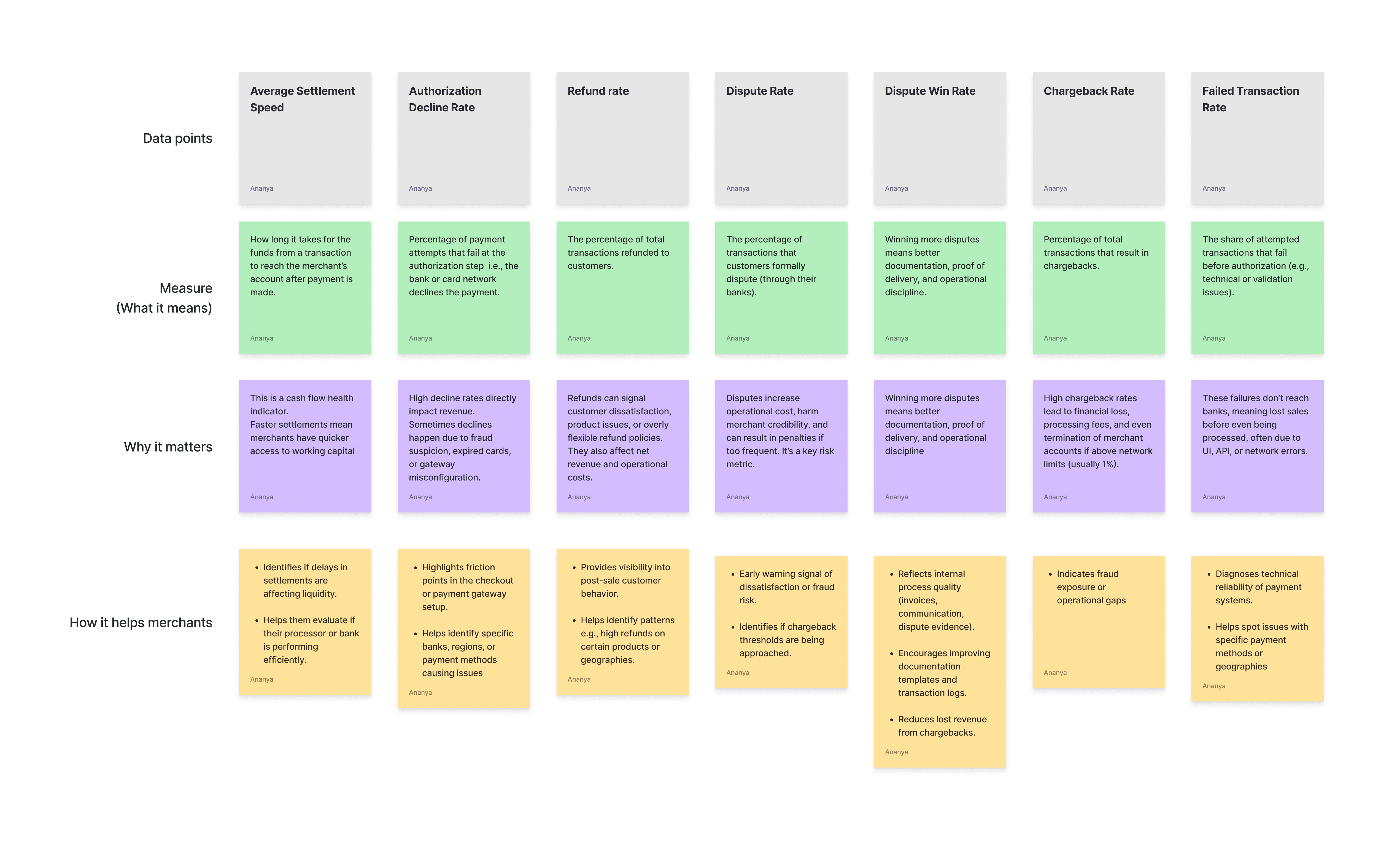

Iteration 3: Focusing on Visual Hierarchy and Scannability
" Focus: Making the statement more intuitive and visually engaging "
Building on the earlier information framework, this iteration was about how the data feels. I wanted the merchant to get a quick, intuitive understanding of their monthly settlement almost like getting a health snapshot of their business.
The design introduced visual grouping and spacing logic that helped users quickly identify patterns like month-over-month performance and inflows vs. outflows. This meant organizing sections so that the eye could move naturally from high-level insights → detailed breakdowns, ensuring clarity and reducing cognitive load.
To support quick comparisons, I added review previous month’s data side-by-side, enabling merchants to spot trends immediately.
Challenges
Here, I wanted to make the information feel alive and useful at a glance. The idea was to help merchants instantly see how their balance or settlements compared to previous months. The challenge was getting the visual hierarchy right
What I learned:
Small visual cues (like spacing, color weight, and typography hierarchy) can completely change how quickly users understand information

Iteration 4: Testing, Simplifying, and Refining for Clarity
" Focus: User testing insights and balancing detail with simplicity."
User testing revealed an important behavior pattern:
Most merchants primarily reviewed page one for insights and totals — very few navigated to the detailed breakdowns unless they were troubleshooting or reconciling discrepancies.
I condensed key metrics and summaries onto the first page, ensuring that the essential business story could be understood at a glance.
The detailed tables (e.g., transaction logs, multi-currency breakdowns) were still accessible, but no longer required for a meaningful first read.
I also refined the spacing, alignment, and column relationships so that the layout felt balanced and readable, rather than like a traditional financial sheet.
Challenges
User feedback showed that while the data was clear, merchants wanted key visuals and summaries right upfront. Many users didn’t go beyond the first page unless necessary.
The challenge was to compress important insights onto the first page without losing detail or context and keeping everything visually balanced
What I learned:
Less data can be more when it’s well-prioritized really well. Designing for real-world reading patterns helped me create a more practical, user-centered design.
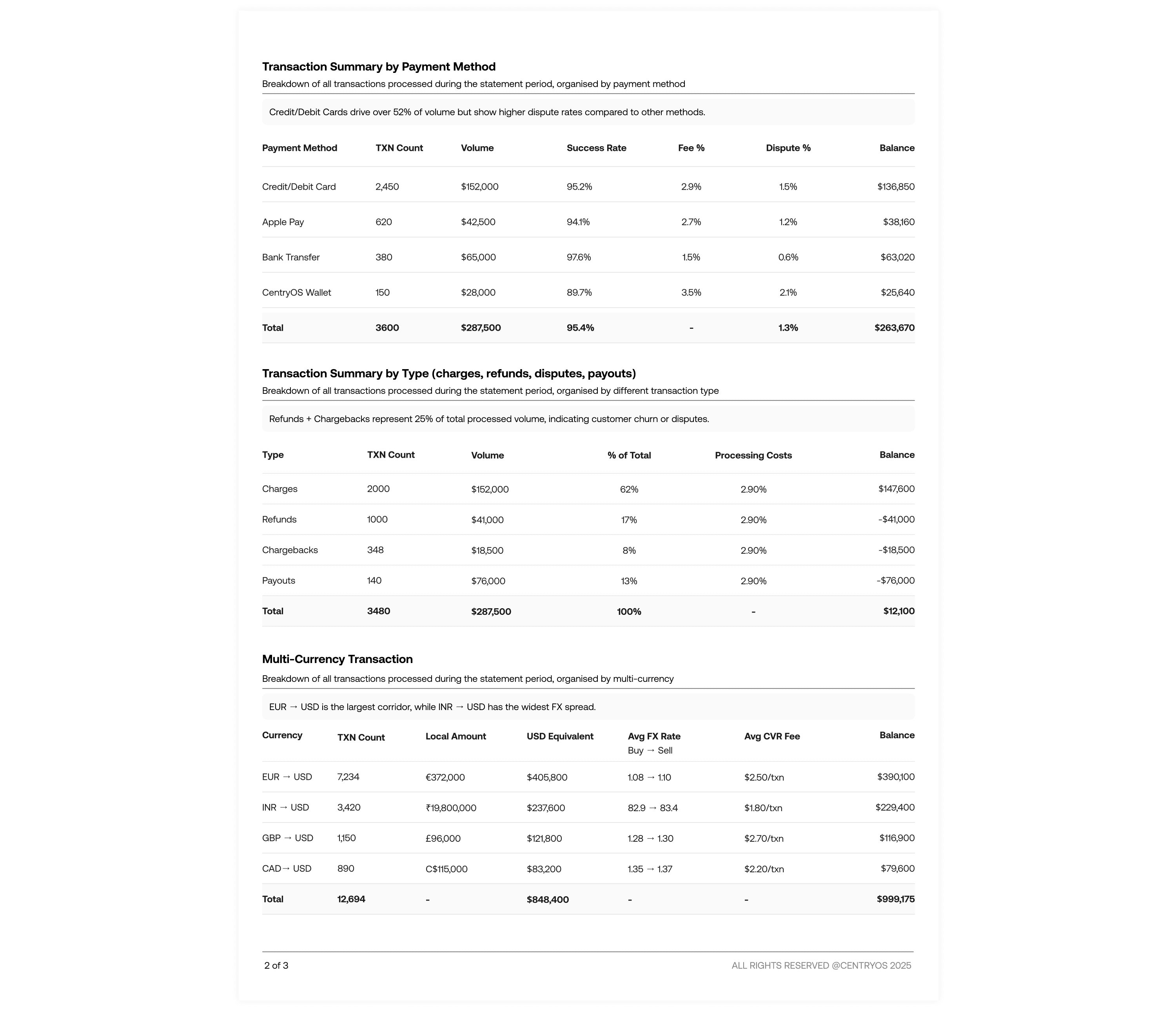
Final Design


Impact of the first design role out
40–60% reduction in time spent reading reports
30–40% increase in monthly statement views
25–35% reduction in merchant support query
What I learned from this project ?
Prioritizing information early helped define a strong foundation for later designs. Getting the data right made the decisions more grounded and purposeful in later visuals stage.
Collaboration with stakeholders revealed that the “right data” isn’t only what’s readable it’s what aligns with business goals and user value simultaneously.
Visual hierarchy is not just aesthetics, it’s the design language that shapes comprehension.
In data-heavy products, clarity isn’t about showing everything, it’s about showing the right things, in the right order.
