Back
Shipped
Fintech
Data-driven decision
Information optimization
Merchant Statements Email Design for Faster Financial Analysis and Clearer Decision Making
The project began with a UX audit of the existing statements, followed by usability testing sessions with merchants to understand how they analyse monthly report. This process revealed key opportunity areas such as visualizing payment trends, improving transaction breakdown visibility, and creating stronger information hierarchy across dense datasets. I collaborated closely with the developer and product stakeholders to identify and prioritize the data points using a priority matrix. The redesign transformed static financial sheets into a more structured and insight-driven experience that supported faster business decisions. The positive outcome of this effort was 92% of merchants preferred the redesigned statement experience and 78% increase in successful information navigation within under a minute ( Discoverability KPI )
Team
1 Product Designer , 1 Manager, 1 Developer,
Project Type
Data Informed UX Designing
Timeline
1 week project
Niche
Cross‑border, blockchain‑based payments

Background
GradientFi is an embedded finance company (web2 front-ends/web3 back-end rails) that integrates cross blockchain infrastructure to power banks, fintechs, and marketplaces. API-first crypto banking infrastructure provides cross border liquidity on a shared ledger with FOREX matching engine, real world asset tokenization, and no-code smart contracts.
My Role
As the sole product designer on this project, I Led the redesign of end-to-end merchant statement experience. I worked collaborated closely with the manager and developer to understand business goals, identify usability gaps, and simplify complex financial data for merchants.
My role involved defining information hierarchy, exploring multiple layout directions, improving readability across dense datasets, and refining the experience through iterative feedback. I also focused on making multi-currency payment data easier to understand and helping merchants make faster, more confident decisions from their monthly reports.
Problem Statement
After conducting 1:1 meetings with key stakeholders and performing preliminary research, I refined the problem statement and reframed it using the extended Jobs to Be Done framework
When merchants receive their monthly processing statement,
they want to quickly understand their business performance, transaction flow, fees, and settlement details,
so they can reconcile accounts faster, identify issues early, and make confident business decisions without manually analyzing dense financial data.
In the current design, users mentions

Goal

Solution
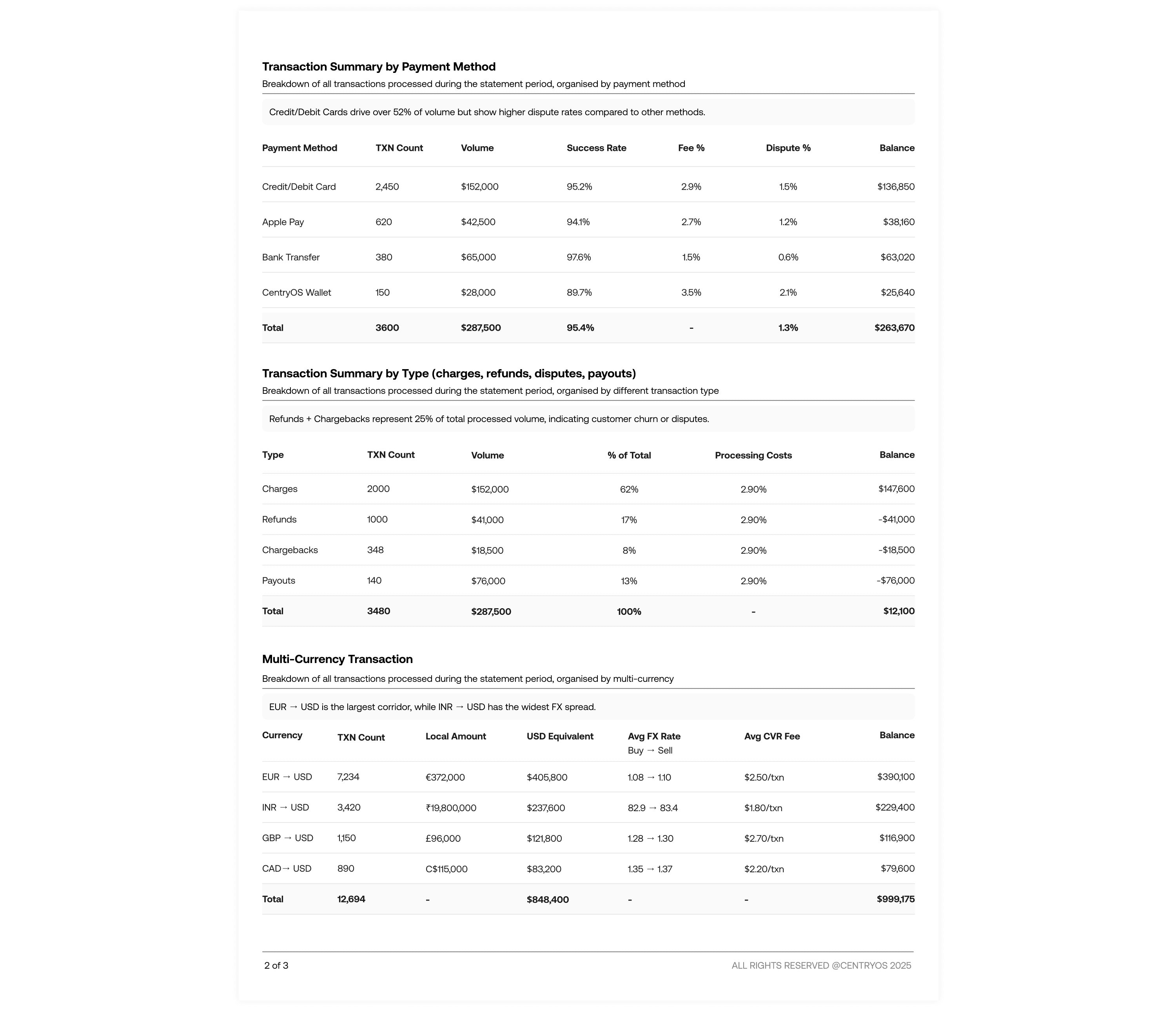
I led the design of the monthly statement emails for merchants using the centryOS platform. I created a detailed email template that clearly organized different transaction types and highlighted the most important financial metrics. The redesign focused on improving readability, information hierarchy, and data visibility, helping merchants understand business performance and make faster decisions with more confidence.
Impact
We received positive feedback from the merchants and the company stakeholder on how these summary emails are beneficial for them to understand key metrics for business performance
92% merchants preferred the new statement experience
30–40% increase in monthly statement views
78% increase in information navigation efficiency
Research and Strategy
The initial problem statement I received from the PM was broad and lacked a clear direction. The ask was simply to redesign the merchant statement experience. To better understand the actual problem, I organized 1:1 meetings with the CEO and manager to learn why the redesign was needed, what was not working in the current experience, and what success would look like from both the business and merchant perspective.
Current design analysis
To understand the gaps in the current experience, I analyzed the existing merchant statement email which was a single-page report with limited insights and little support for business decision-making. I conducted a rapid UX audit along with usability testing sessions to observe how merchants navigated the statement and interpreted financial information.

These findings made it clear that the problem was how the information was being structured and presented.
Merchants struggled to identify the most important metrics
Financial data lacked hierarchy and felt overwhelming to scan
Lack of transaction breakdown understanding
Research questions
After the initial research, I developed the following questions to guide the design direction
What financial metrics are most relevant and valuable for merchants?
How can the statement support faster and more confident business decisions?
How can we structure complex transaction data in a way that feels clear and easy to navigate?
Addressing the research questions
To identify the most meaningful metrics, I collaborated with stakeholders and used a priority matrix to evaluate which data points were most important based on business value, merchant needs, and frequency of use. This helped us focus on surfacing information that merchants actually use for reconciliation and performance tracking rather than showing excessive raw data.
To improve decision-making, I explored ways to summarize key business insights upfront instead of forcing users to manually scan detailed tables. I also tested different hierarchy patterns and layouts to make navigation faster and reduce cognitive load while reading dense financial information.

Prioritization matrix for data points
Design Opportunity
The research revealed two major opportunity spaces within the statement experience:
Visualizing Financial Trends and Business Performance
Merchants needed a faster way to understand how their business was performing without manually comparing numbers across reports.
Improving Transaction Breakdown Visibility
Users wanted clearer visibility into settlements, fees, payouts, and currency movement to better understand where money was coming from and where it was going.
Design principles
I started by defining a set of design principles to guide the project and help me make clearer design decisions throughout the process. These principles helped me prioritize what actually mattered for merchants while making trade-offs faster. Having this foundation also made my decisions easier to justify because every choice was connected back to a principle rather than personal preference.
Hierarchy of data
Order and grouping of data gives more clarity then color ever will.
Being Clear with currency movement
Being transparent with how currency data flows and affects the business
Every number should have meaning
If it doesn’t change behavior or explain totals, it’s noise.
Final Design
The final solution focused on improving information hierarchy and making financial data easier to access and understand for merchants. Important metrics and summaries were prioritized at the top, while related data points were grouped together to reduce cognitive load and improve scanability. Clear sectioning, spacing, and visual structure helped merchants navigate complex transaction details faster and make more confident business decisions from the statement itself.


What I learned from this project and what I will do differently next time ?
This project helped me understand that designing for fintech is not only about presenting data clearly, but also about building trust through information. I learned how important information hierarchy becomes when users are dealing with dense financial reports and trying to make quick business decisions. Working through multiple iterations also showed me that good data design comes from understanding what users actually need, not from displaying every available metric.
One of the biggest learnings for me was balancing business goals with usability. Through discussions with stakeholders and usability testing, I realized that the most valuable insights are often the simplest and most accessible ones. Small changes in grouping, spacing, and prioritization had a major impact on how quickly merchants could understand the statements.
If I were to approach this project again, I would involve merchants earlier and more consistently throughout the design process instead of validating mainly during later iterations. I would also explore more personalized reporting experiences based on different merchant needs and business sizes. In the future, I would like to test interactive statement experiences instead of static email reports to make financial insights even more actionable and easier to explore.
Copyright ©2026. All right reserved Ananya Vashist


